Mobile considerations
Today, almost 50% of users access the web from mobile devices. What does this mean for us web designers? It means that we must have a mobile strategy for every mobile website design.
Responsive design
It’s essential to optimise your website for various screen sizes and resolutions. Some core guidelines to follow include:
- Aim for a single-column layout. A single-column layout usually works best on mobile screens because it scales well between different device resolutions and between “landscape” and “portrait” mode.
- Use the “Priority plus” pattern to prioritize navigation across breakpoints. Priority plus is a term coined by Michael Scharnagl to describe navigation that exposes the most important elements and hides away less important items behind a “more” button. This type of navigation uses the available screen space; as space increases, the number of exposed navigation options increases as well, which leads to better visibility and more engagement.
This pattern is especially good for content-heavy websites with a lot of different pages and sections, such as a large retailer’s e-commerce store or a news. An example of this would be to use Priority+ pattern for section navigation and when the user hits the “All” button less important items show up.
- Size images appropriately for different platforms and displays. A website must adapt to look perfect on all of the different devices and in all of the various resolutions. Creating great-looking images on the web is one of the main challenges web designers face when building responsive websites. Tools like the Responsive Image Breakpoints Generator simplify this generating breakpoints for images interactively.
From clickable to tap
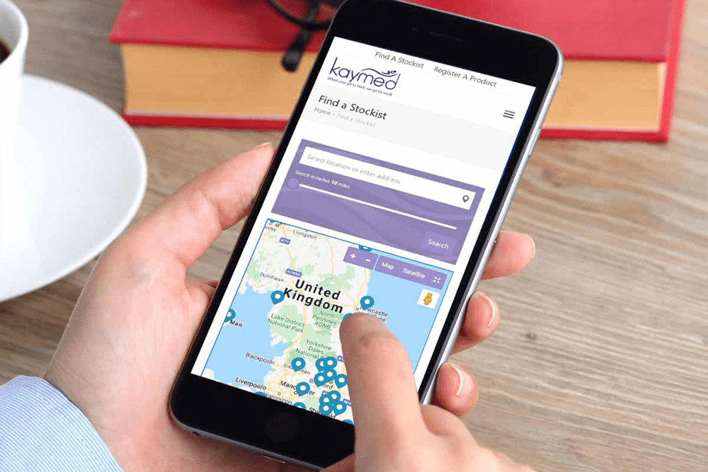
On the mobile web, finger taps (not mouse clicks) create interactions. This means that different rules apply when you’re designing touch targets and interactions.
- Correctly sized touch targets. All interactive elements (such as menus, buttons and links) should a bit larger and suitable for tapping. To choose a proper size for your buttons the work of MIT Touch Lab’s study is useful – click here
- The MIT study found that 10mm ×10mm is a good minimum touch target size. This rule works for both designing apps and websites.
- On mobile, there is no hover state to provide additional visual feedback to your user. Therefore stronger visual signifiers of interactivity are required, to allow users to correctly predict how an interface element will behave just by looking at it. With buttons, for example, consider using a square shape with a subtle shadow.
Accessibility
Another essential website design guideline is accessibility. Today’s websites must be accessible to everyone, regardless of a person’s abilities. Designing for users with impairments should be an integral part of product design.
Users with poor eyesight
A lot of websites use low contrast for text copy. While grey text on a white background may look cool, it is also illegible and inaccessible. Low contrast is especially problematic for users with low vision and those who struggle with contrast sensitivity.
Low-contrast text is hard to read on a desktop, but it becomes even more difficult on mobile. Imagine trying to read low-contrast text on a mobile device while walking in bright sunlight.
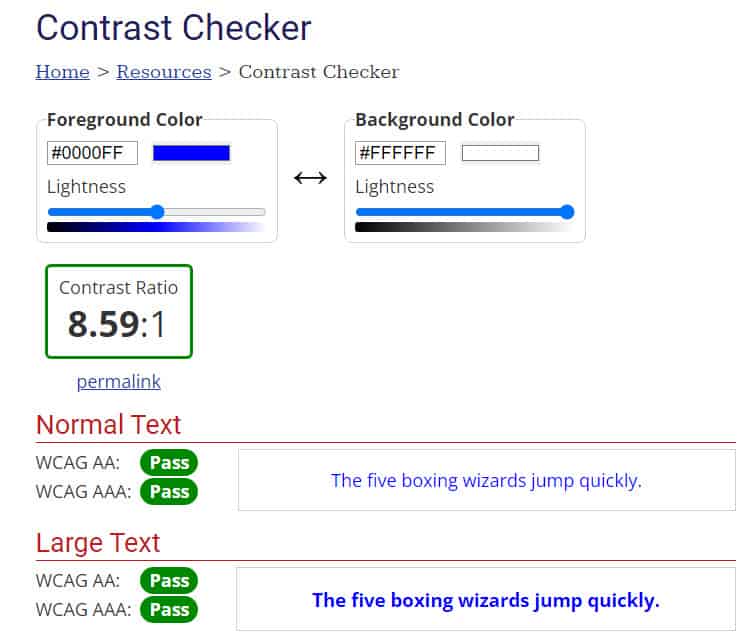
The most important characteristic of text and other vital elements on a website is readability, which requires sufficient contrast between the text and the background. To ensure that text is readable by people with visual impairments, the W3C’s Web Content Accessibility Guidelines (WCAG) includes a contrast-ratio recommendation. They recommend the following contrast ratios for body text and image text:
- Small text should have a contrast ratio of at least 4.5:1 against its background. A ratio of 7:1 is preferable.
- Large text (at 14-point bold and 18-point regular and up) should have a contrast ratio of at least 3:1 against its background.
- You can use WebAIM’s Color Contrast Checker to quickly find out whether you’re within the optimal range.

Low-vision and Colour blind users
It’s estimated that 4.5% of the global population experience colour blindness (that’s 1 in 12 men and 1 in 200 women), 4% suffer from low vision (1 in 30 people), and 0.6% are blind (1 in 188 people).
To make design accessible for these users, avoid using colour alone to convey meaning. As the W3C states, colour shouldn’t be used “as the only visual means of conveying information, indicating an action, prompting a response, or distinguishing a visual element.”
Red and green are the two most difficult colours to distinguish for people with colour-vision deficiency. But on forms these colours are used with success and error messages are often green and red, respectively. You’ve likely seen error messages that indicate something like “the fields marked in red are required.” While it might not seem like a big deal, this error message can be extremely frustrating for people with a colour-vision deficiency. Instead, designers should use colour to highlight or complement what is already visible.
Blind users
Images and illustrations are a significant part of the web experience for people who can see and for blind users. Blind people use assistive technologies, such as screen readers, to interpret websites. Screen readers “read” images using the alternative text attributed to the image. If that text is not present or is not descriptive enough, they won’t be able to get the information as intended.
When creating text alternatives for images, follow these guidelines:
- All “meaningful” images require descriptive alternative text. (A “meaningful” photo adds context to the information on the page.)
- A text alternative isn’t needed if an image is purely decorative and provides no useful information to the user.
Creating keyboard-friendly experiences
Certain users, such as those with motor skill impairments, prefer to navigate the internet using a keyboard, rather than a mouse. It’s important to enable keyboard-based navigation to cater to this group,
Some basic rules for keyboard navigation:
- Check that keyboard focus is visible and obvious. Some web designers remove the keyboard focus indicator because they think it’s an eyesore, which hinders keyboard users from properly interacting with the website.
- Keyboard users must be able to access all interactive elements, not just the main navigation options or primary calls to action.
You can find detailed requirements for keyboard interaction in the “Design Patterns and Widgets” section of the W3C’s “WAI-ARIA Authoring Practices” document.
- The keyboard focus should be visible for all sighted users. Although the focus varies from browser to browser we recommend using CSS to make the keyboard focus more visible by adding a background colour or any style to make the focus visible.
- To customise keyboard focus, the built in outline CSS property allows to change the style, width, and colour of the focus box.
- Recommended: Use solid, 3px wide, accessible colour for outlines.
- The background of focused can also be changed, but only recommended with accessible colours.
- Avoid using custom colour styles unless you can meet the 3:1 colour contrast ratio.
- To ensure keyboard focus is present, avoid using the outline:none attribute.

Want to pick up the phone and speak to us about your Website project?
Call us on: 01733 361729 mail: solutions@bdolphin.co.uk
Mobile Website Design Testing
Even if you’ve followed all of the website design guidelines above, it doesn’t mean that it will work for your users. The only way to know for sure is “test early and test often.
Iterative testing
Like any other part of the design cycle, testing is an iterative process. Gather feedback early on in the design process and iterate throughout.
Test page loading time
Users hate slow-loading web pages. That’s why response time is a critical factor for modern websites. According to Nielsen Norman Group, there are three response-time limits:
- 0.1 seconds gives the feeling of instantaneous response — that is, the outcome feels like it was caused by the user, not the computer. This level of responsiveness is essential to support the feeling of direct manipulation (direct manipulation is one of the key GUI techniques to increase user engagement and control.
- 1 second keeps the user’s flow of thought seamless. Users can sense a delay, and thus know the computer is generating the outcome, but they still feel in control of the overall experience and that they’re moving freely rather than waiting on the computer. This degree of responsiveness is needed for good navigation.
- 10 seconds keeps the user’s attention. From 1–10 seconds, users definitely feel at the mercy of the computer and wish it was faster, but they can handle it. After 10 seconds, they start thinking about other things, making it harder to get their brains back on track once the computer finally does respond. A 10-second delay will often make users leave a site immediately. And even if they stay, it’s harder for them to understand what’s going on, making it less likely that they’ll succeed in any difficult tasks.
Obviously, we shouldn’t make users wait 10 seconds for anything on our websites. But even a few seconds of delay can make an experience unpleasant.
What usually causes slow loading time?
- Heavy content objects (such as embedded video and slideshow widgets)
- Unoptimized back-end code
- Hardware-related issues (infrastructure that doesn’t allow for fast operations).
Tools like webpagetest, page speed insights, gtmetrix and Google page speed insights are very useful to help you find the causes of a slow loading website.
A/B testing
An A/B test is ideal when you’re struggling to choose between two versions of a design. This testing method consists of showing one of two versions randomly to an equal number of users and then reviewing analytics to see which version accomplished your goal more effectively. There used to be a site called whichtestwon, this no longer exists but this is another great AB testing site
Design handoff
The UX design process has two important steps: prototyping the design and developing a working solution. The “handoff” is the step that connects the two. As soon as the design is ready for development, designers prepare a specification, which is a document that describes how to code the design. A specification ensures that the team implements the design according to the original intention.
A good specification is critical because without it, the developers will have to either rely on guesswork when building the website or go back to the designer to get answers to their questions. But assembling a specification manually can be a headache and usually takes significant time, depending on the complexity of the design.
Mobile Website Design Conclusion
Of course, these web design tips are just a start. Mix and match these ideas with your own for the best results. Treat your website as a continually evolving project and use analytics and user feedback to constantly improve the experience. And remember that design isn’t just for designers—it’s for users.
Mobile Website Design – Ensure Your Site Is Responsive
Having a responsive website that works well on mobile devices is crucial in today’s digital landscape. Mobile usage has become ubiquitous, with a significant portion of internet traffic originating from smartphones and tablets. As a result, it is essential to cater to the growing number of mobile users by providing a seamless and optimised browsing experience.
User expectations play a vital role in the importance of a responsive website. Users anticipate websites to function properly on their mobile devices, regardless of the screen size. They want to access information, make purchases, and engage with content effortlessly. A responsive website ensures that users have a consistent experience across different devices, eliminating the need for excessive zooming, scrolling, or horizontal swiping.
One of the primary benefits of a responsive website is an enhanced user experience. Responsive design adapts the layout and content of a website to fit the screen size of the device being used. This adaptability ensures that users can navigate and interact with the site easily. By providing a user-friendly experience, businesses can increase engagement, reduce bounce rates, and improve conversion rates.
Moreover, a responsive website positively impacts search engine optimisation (SEO) efforts. Search engines like Google prioritise mobile-friendly websites in their search results. Responsive sites have a single URL and consistent HTML across devices, making it easier for search engines to crawl and index content. Additionally, mobile-friendly websites are more likely to receive backlinks and social media shares, further boosting their SEO ranking.
Faster page load times are another advantage of responsive websites. Mobile users often have slower internet connections compared to desktop users. A responsive website optimises images, CSS, and JavaScript for mobile devices, resulting in faster page load times. Improved speed not only enhances the user experience but also contributes to better search engine rankings, as site speed is a ranking factor for search engines.
From a practical standpoint, a responsive design offers cost and time efficiency. Developing and maintaining a separate mobile website requires additional resources, including time and money. With a responsive design, businesses can create a single website that automatically adjusts to different devices. This approach simplifies website management, updates, and content creation, ultimately reducing overall costs and saving time.
Lastly, having a responsive website provides a competitive advantage. A website that offers a better mobile experience compared to competitors is more likely to attract and retain users. By catering to the needs and preferences of mobile users, businesses can increase visitor engagement, conversion rates, and overall success in the online market.
In summary, having a responsive website that works well on mobile devices is essential for providing a positive user experience, improving SEO performance, and staying ahead of the competition in today’s mobile-centric world.
If you would like to know more about Mobile Website Design contact Andrew Goode MBA, MSc, FCIM Click here to arrange a call
Other articles linked with websites and marketing that may provide additional insight. Marketing metrics and analytics, marketing ROI Planning , marketing revenue analytics and Marketing Measurement Metrics and Website Design
If you are looking at generating online saes as part of an ecommerce strategy the following information may be of use. Combine with this boring but important information on what’s required to remain website compliant

