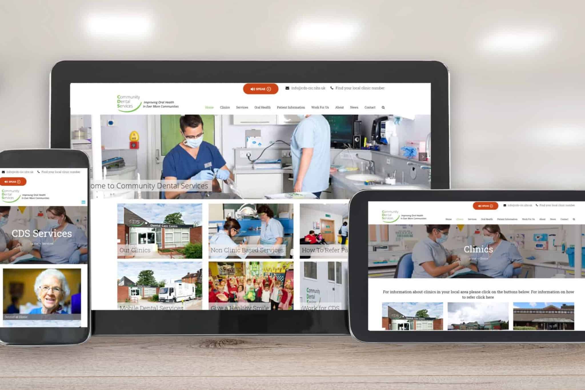
How To Design A Website for maximum performance is a complex subject. Designers and developers have to consider both functional design (how the website works) and visual appearance (how the website looks). The process of design can be tricky, with so many elements that you need to take into account. To help you through the process, we have prepared this article.
In this article, we’ll focus on the main principles and approaches that will help you create a great user experience for your website. Starting with global elements, like user flows (how to define the structure of the website), and then working through to individual pages (what to consider during web page design). Additionally we look at other essential aspects of design, such as designing for mobile considerations and testing processes.
Designing the website user flow
The first thing to consider is the path by which the visitor will navigate through your website or your “user flow”. Its vitally important to consider that web page design isn’t about creating a collection of individual pages; it’s about creating flows. This path is a series of steps that the visitor takes from the entry point (the first page where they land) toward the specific action you want them to take (typically a conversion action, such as a sign-up, purchase, etc.).
The following will help you determine your user flows as you design your website.
Information architecture
Information architecture (IA) is a practice that allows you to organise information clearly and logically for your visitors. Professionals in this field are called Information architects. These people analyse how users structure information and create a hierarchy that aligns with the user’s expectations. Solid user research and usability testing result in Good IA.
There are several ways to research user needs.
- The process’s an information architect will complete include
- Taking an active part in user interviews,
- Card sorting,
- Conducting moderated usability testing where people are observed on how people interact with the existing website design and share their opinions on it.
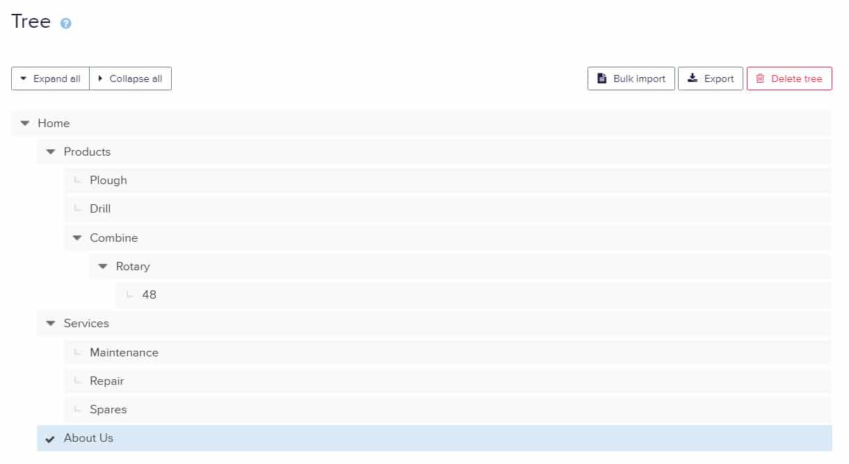
Information Architecture is also used to define the site’s menus and navigation. When UX practitioners finish working on a menu, they use a technique called “Tree Testing” to prove that it will work. Tree testing happens before designing the actual interface.
Global navigation
Navigation is a cornerstone of usability. If visitors can’t navigate your website, they will most likely leave. Your website should adhere to a few navigation principles:
- Consistency. The navigation system should be the same for all pages on the website.
- Simplicity. Your navigation should help visitors understand how to get around on your site with the fewest clicks possible.
- Clarity. There shouldn’t be any guessing about what each navigation option means.
When designing navigation consider the following:
- Select a navigation pattern based on the user’s needs. Navigation should accommodate the needs of the majority of your website visitors. For example, only use hamburger-menu navigation if the majority of your users are familiar with the meaning of the icon itself.
- Prioritise navigation options. According to common user tasks, prioritise navigation options, considering both priority and frequency of tasks.
- Make it visible. Make important navigation options permanently visible to minimise the user’s cognitive load. If navigation options are removed we risk that visitors won’t be able to find them.
- Communicate the current location. A common problem on many websites is failing to indicate the visitor’s current location. If visitors are wondering on the site, “Where am I in the website?” ,that’s a clear indication that your website navigation needs some work. For larger websites, the use of breadcrumbs, as location indicators can be beneficial.
Visual and functional design of web links
Links are a key element in web navigation. Their visual and functional design has a direct impact on usability. For best performance with these interactive elements follow these rules
- Recognize the difference between internal and external links. Users expect different behaviour for internal and external links. All internal links should open in the same tab so that visitors can use the “back” button.
- Change the colour of visited links. When visited links don’t change colour, users have the potential to revisit the same pages multiple times.
- Double-check all links. It’s frustrating to arrive at a 404-error page. Use tools like Dead Link Checker
“Back” button in a browser
The “back” button is perhaps the most used button in the browser, so make sure it works according to user expectations. When a user follows a link on a page and then clicks the “back” button, they expect to return to the same spot on the original page. Avoid situations in which clicking “back” brings the user to the top of the initial page, instead of where they left off, especially on long pages. Losing their spot forces the user to scroll through content they have already seen, which leads to unnecessary interaction cost.
Breadcrumbs
Breadcrumbs are a set of contextual links that function as a navigation aid on websites. It’s a secondary navigation scheme that usually shows the user’s location on a website.
While breadcrumbs don’t require much explanation, there are a few things worth considering:
- Don’t use breadcrumbs as a replacement for primary navigation. Breadcrumbs should only support navigation, visitors should first and foremost use the main menu for navigation. If breadcrumbs are used as a primary method of navigation, rather than the main menu, it is a clear indication of poor navigation design.
- Separate each level clearly. With breadcrumbs use arrowheads as separators, not slashes. The main reason for this is that a forward slash ( / ) can easily clash with product categories on e-commerce websites. If you’re going to use the forward slash, ensure that no product category will ever have a slash:
Search Capability
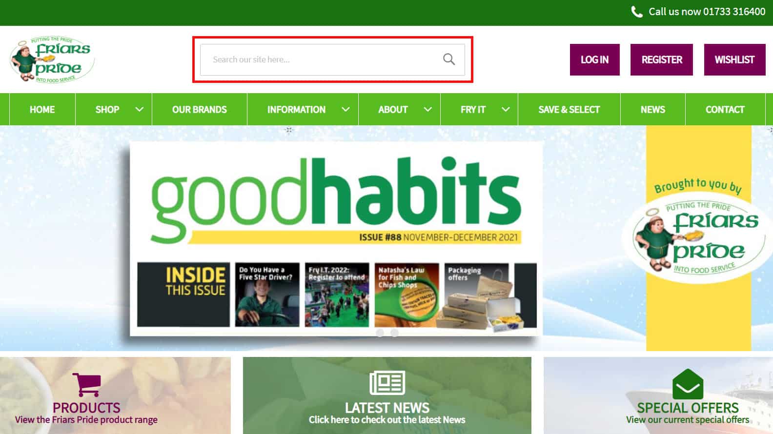
Some visitors come to a website looking for a specific product or service. Since they have a clear knowledge of what they want, they probably won’t use the navigation options to find it. The “Search Box” feature will act as a shortcut in this case. Visitors should be able to type text in a search box, submit their search query, and find the page they’re looking for.
When designing the search box, consider these few basic rules:
- Put the search box where users expect to find it. Research shows that the most convenient spot for a search box is the top left or top right of every page on a website.
- Use a magnifying glass icon to draw attention to the area. The magnifying glass icon has a universal meaning—most users are familiar with it. To draw attention to your search bar, use an icon like a magnifying glass
- Size the input box appropriately. A common mistake is making the input field too short. Of course, users can type a long query into a short field, but only a portion of the text will be visible at a time, which isn’t great for usability. When a search box is too short, visitors tend to use short, imprecise queries, because longer queries can be hard and inconvenient to read.
- 90% of queries will be accommodated by a 27 character field
- Put the search box on every page. Show the search box on every page so that users can access it regardless of where they are on the website.
Designing individual pages
Once user flow has been evaluated, it’s time to consider the design the individual web pages. The key website design guidelines are summarised below.
Content strategy
- When it comes to web page design, the most important thing is to design around the page’s objectives.
- Content strategy – refers to planning, creating, and managing content on your website
- Each web page should have its own goal, such as informing visitors about something or encouraging them to convert.
- Once you understand the goal of the page, only then should you work on the design or write the content.
Some practical tips to consider with your content strategy:
Prevent information overload.
- Too much information on a page can easily overwhelm visitors.
- There are some simple ways to minimize information overload. A common technique is chunking: breaking content into smaller chunks to help users understand and process it better.
- A checkout form is a perfect example of this. Display, at most, five to seven input fields at a time and break down the checkout process into easy steps, as seen in the image.
- Avoid jargon and industry-specific terms. The safest bet is to write for all reading levels and pick words that are easily and clearly understandable to everyone. Each unknown term or phrase that appears on the page will make it that much harder for visitors to understand the information. .
- Minimise long sentences. Write in small, scannable segments. A web tool such as Yoast has a readability function. For example sentences should be 20 words or fewer.
- Avoid capitalising all letters. All-caps text is fine for acronyms and logos. But it’s best to avoid all caps for paragraphs, form labels, errors, and notifications.
Page structure
While there are no one-size-fits-all rules, there are a few website design guidelines that will help you create a robust structure. A properly structured page will help visitors find each user interface element.
- Make it predictable. Look at your competitors’ websites, identify common design patterns, and align with user expectations by using design patterns that are familiar to your target audience.
- Use a layout grid. A layout grid divides a page into major regions and defines the relationships between elements in terms of size and position. With the help of a grid, combining different parts of a page in a cohesive layout becomes much easier.
- Use a low-fidelity wireframe to privatize essential elements. Wireframing can save web designers a lot of time. Before building the page with real elements, create a wireframe, analyse it, and remove anything that isn’t absolutely necessary.
Visual hierarchy
In todays fast moving digital world people are more likely to quickly scan a web page than to read everything there. Therefore, optimise your web page design for fast scanning.
You can help visitors find what they need with a good visual hierarchy. This refers to the presentation or arrangement of elements on a web page in a way that indicates their importance. For example where the persons eyes should focus first, second, etc.). Good visual hierarchy can significantly improve page scan ability.
Use natural scanning patterns.
- Web designers, have a lot of control over where people look when they’re viewing a page. The F-shaped pattern and the Z-shaped pattern are two natural scanning patterns that can help you to set the right path for the visitor’s eyes.
- For text-heavy pages, such as articles and search results, the F pattern is better, whereas the Z pattern is good for pages that aren’t text-oriented.
- Visually prioritise important elements. Make important elements, such as key content or your primary call-to-action buttons, the focal points so that visitors see them right away.
- Create mock ups to clarify the visual hierarchy. Mock ups are high-fidelity design artefacts that enable designers to see what the final layout will look like. Rearranging elements in a web design tool is much easier than doing it with code.
Scrolling behaviour
A persistent myth among web designers is that people don’t scroll. This was the case ten years ago but overtime and certainly with the arrival of mobile scrolling has increased. To be clear: everybody scrolls, and people start to scroll almost instantly as they land on a new page.
Knowing that visitors to your site will scroll can help you improve the user’s experience
- Encourage users to scroll. Content at the top of the page is still very important, despite the fact that people usually start scrolling as soon as the page loads. Ensure that your most compelling content at the top:
- A good introduction. A compelling introduction answers the visitor’s questions and sets the context for the content answering information about, “What’s this page all about?”
- Engaging imagery. Great imagery should accompany text and help visitors better understand the idea or topic.
- Orient your users.
- When you create long pages, bare in mind that visitors still require a sense of where they are on the page (of their current location) and a sense of navigation (other possible paths).
- Long pages can create navigation problems for users;
- If the top navigation bar loses visibility when the user scrolls down, they will have to scroll all the way back up when they’re deep within the page.
- An obvious solution to this is a sticky menu that shows the current location and that remains on screen in a consistent area at all times.
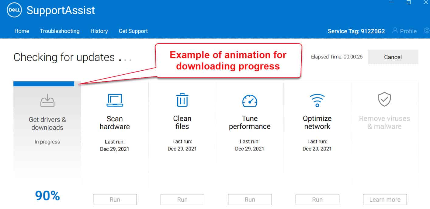
- Provide visual feedback when loading new content. Content-loading during scrolling should be fast (no longer than two to 10 seconds), you can use looped animation to indicate that the system is working.
- Don’t hijack scrolling. With website design, let the user control their browsing experience.
Content loading
While an instant response is best, there are occasions when your website will need more time to deliver content to visitors.
A poor or low quality internet connection could cause a slow reaction, or an operation itself could take a bit more time to complete. Regardless your website should appear fast and responsive. The following approaches will help achieve this:
- Make sure regular loading doesn’t take long. Even with the most beautifully designed loading indicator, users will still leave if it takes too long. Our natural attention span is very low. According to Nielsen Norman Group research, 10 seconds is about the limit! When visitors have to wait for a website to load, they may become frustrated and leave.
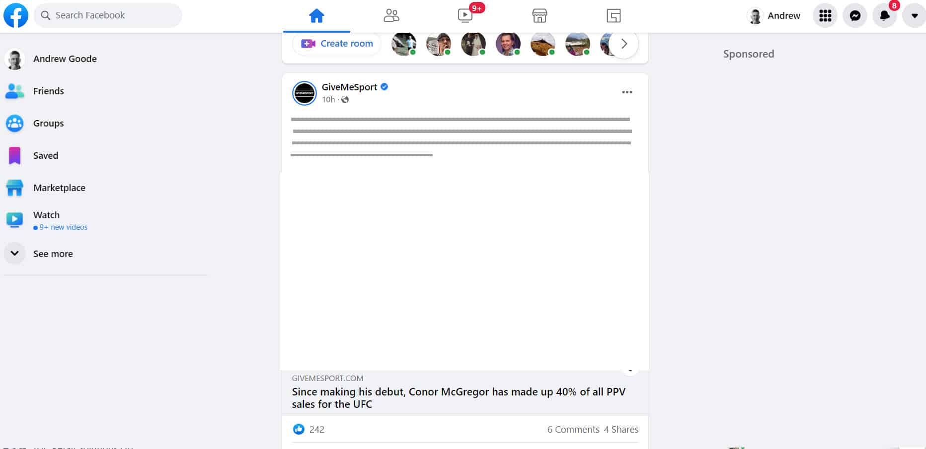
- Use skeleton screens during loading. Many websites use progress indicators to show that data is loading. While the intention behind a progress indicator is good, since it provides visual feedback, the result can be negative.
Rather than showing a loading indicator, designers can use a skeleton screen to focus users’ attention on actual progress and create anticipation for what’s to come. Skeleton screens are an excellent alternative to this. These containers are essentially a temporarily blank version of the page, into which information is gradually loaded. Because information is incrementally displayed on the screen, it feels like things are happening immediately.
Facebook uses skeleton screens to fill out the UI as content loads incrementally.
Buttons
Buttons are interactive user interface elements that play a key role in conversational flow. The following are basic best practices for these buttons:
- Ensure that clickable elements actually look clickable. The way an object looks tells users how to use it. Visual elements that look like links or buttons but aren’t clickable, can easily confuse users. Examples include underlined words that aren’t links or elements that have a rectangular background but aren’t buttons, .
- Label buttons according to what they do. The label on any actionable interface element should always tie back to what it will do for the user. Descriptive labels can help with this. Abstract labels like in the example or Vague labels such as “Submit” don’t provide enough information about the action. Users will feel more comfortable if they understand what action a button does.
- A good website design guideline is to be clear with your button text so that users understand what the interface element does
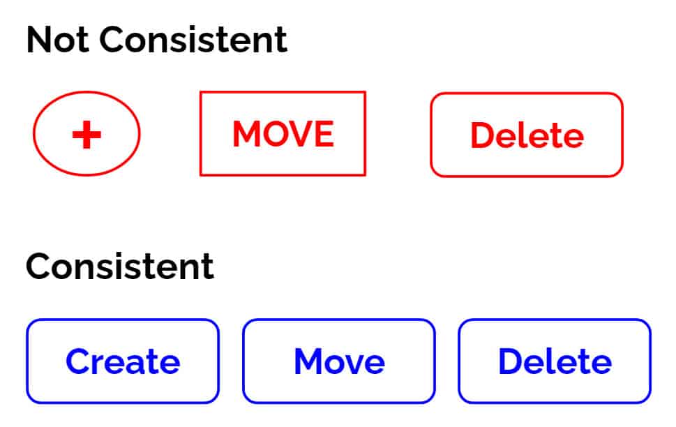
- Design buttons consistently. See the example illustrated, using three different button shapes will leave your user confused. Users remember details, whether consciously or not. When browsing a website, they’ll associate a particular element’s shape with button functionality. Therefore, visual consistency will not only contribute to a great-looking design but will also make the element’s behaviour more predictable to visitors.
Imagery
As the saying goes, a picture is worth a thousand words. Human beings are highly visual creatures and images are a powerful way to capture the user’s attention. A single image can convey more to the viewer than an elaborately designed block of text. Furthermore, images cross language barriers in a way that text simply can’t.
The following principles will help you integrate imagery into your web page design:
- Make sure images are relevant. One of the biggest dangers in design is imagery that conveys the wrong message. Select images that are clear and support your product goals.
- Use high-quality assets with no distortion. The quality of the visual assets on your website can have a tremendous impact on the user’s impression. Pixelated images make visitors doubt the quality of your product, so make sure to test resolution sizes for various ratios and devices.
Videos
Today, video is everywhere. We’re watching it on our mobile phones, desktops and tablets. With faster Internet speeds, videos are increasingly popular, especially considering that they extend the time spent on site. Video conveys more emotion and really gives people a feel for a product or service. When used effectively, video is one of the most powerful tools available for engaging an audience.
Consider the following recommendations if you want to use video on your website, :
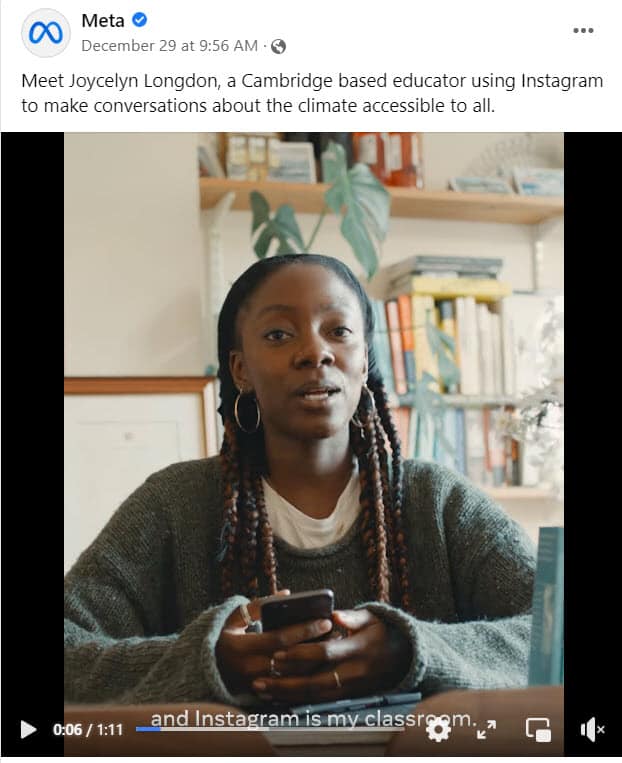
- Set audio to “off” by default, with the option to turn it on. When users arrive on a page, they don’t expect that it will play any sound. If they’re in a public place and not wearing headphones, they might not appreciate sudden and unexpected audio. In most cases, users will leave the website as soon as it plays.
- Keep promo videos as short as possible. According to research the majority of users find shorter videos more appealing. Keep business videos in the range of two to three minutes.
- Provide an alternative way to access content. Always try to design your products for users with various abilities, including those who can’t hear or see. For accessibility, include captions and a full transcript of the video.
Call-to-action buttons (CTAs)
Calls-to-action (CTAs) are buttons that guide users toward your conversion goal. The whole point of a CTA design is to direct visitors to a specific action. Some common examples of CTAs are:
- “Start a trial”
- “Download the book”
- “Sign up for updates”
- “Get a consultation”
Take a few things into account when designing CTA buttons:
- Size. Your CTA should be large enough to attract attention. A quick five-second test will help you determine the right size. View a web page for five seconds and then list the elements you remember. If the CTA is among the elements, then congrats! It’s sized appropriately.
- Visual prominence. You can make certain buttons stand out by giving them more visual prominence. Contrasting colours work best for CTAs and make for striking buttons.
- Negative space. Along with size and colour, the amount of space around a CTA plays an important role in the visual hierarchy of elements. White (or negative) space creates essential breathing room and separates the button from other elements in the interface.
- Labels. Use action-oriented text for CTA labels, as this will compel visitors to take action. Use strong verbs like “Start,” “Get,” or “Join.”
- Tip: Use a “blur test” to test your CTA. A blur test is a quick technique to determine whether the user’s eye will go where you want it to go. Take a screenshot of your page and apply a blur effect in Adobe XD (see the example on Oxfam ). Looking at the blurred version of your page, which elements stand out? If you don’t like what you see, revise.
Web forms
Filling out forms is one of the most important types of interaction for users on the web. Users should be able to complete forms quickly and without confusion.
Some design recommendations to help you improve form design:
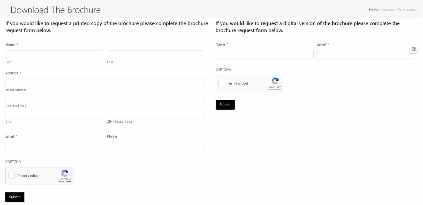
- Ask only what’s required. Every extra field you add to a form will affect its conversion rate. The more you ask, the less motivated users will be to provide the data. Always think about why you’re requesting certain information from users and how you will be using it. If all you want is a name and email then just ask for these
- Order the form logically. For example, asking for someone’s address before their name might seem strange.
- Group related fields together. Grouping creates a flow from one set of questions to the next. Grouping related fields together also helps the user make sense of the information.
Animation
Animation is another important tool for effective interaction. More and more designers are incorporating animation as a functional element to enhance the user experience. However, animation in design can enhance the user experience only if it’s incorporated at the right time and place. Good UI animation has a purpose; it is meaningful and functional.
Here are a few cases in which animation can enhance the user experience:
- Visual feedback on user action. Good interaction design provides feedback. Visual feedback is helpful when you need to inform users about the result of an operation. If there’s a problem, functional animation can provide that information. For example, a shake animation can indicate that the user entered the wrong password.
- Navigational transitions. Navigational transitions are movements between states on a website, such as from a high-level view to a detailed view. Functional animation creates a connection between the two states and smoothly transports users between them.
- Parallax effects. Parallax is a popular technique in web design in which the background moves at a different speed than the foreground content while scrolling. This effect can introduce a sense of dynamics and movement into web layouts. (Learn more about parallax best practices here.)
How To Design A Website
Designing a website involves a careful balance of various principles and practices to create an effective and engaging online presence. By understanding the target audience and their needs, implementing intuitive navigation, utilising visually appealing design elements, ensuring responsiveness across devices, optimising performance, organising content effectively, and continuously testing and refining, designers can create websites that offer a seamless user experience and drive desired outcomes.
A well-designed website not only attracts and retains visitors but also establishes a strong brand identity and supports business goals. It serves as a powerful tool to communicate information, showcase products or services, and engage users. By following the best practices outlined in the article, designers can create websites that captivate users, enhance their interaction, and leave a lasting impression.
However, it is essential to recognize that website design is not a one-time task but an ongoing process. The digital landscape evolves rapidly, and user preferences and expectations change over time. Therefore, designers should regularly evaluate and optimize their websites to adapt to these changes and provide a superior user experience.
Ultimately, a well-designed website acts as a gateway for users to connect with a brand, making it a crucial component of any online strategy. By incorporating the principles and practices highlighted in the article, designers can create websites that not only meet the needs of their target audience but also deliver a memorable and impactful online experience.
If you would like to know more about how to design a website contact Andrew Goode MBA, MSc, FCIM Click here to arrange a call
Other articles linked with marketing metrics that may provide additional insight. Marketing metrics and analytics, marketing ROI Planning , marketing revenue analytics and Marketing Measurement Metrics
5 How To Design A Website FAQs.
1. Do I need any technical knowledge to design a website for my business?
Not necessarily. Many modern website builders, such as WordPress, Wix, and Squarespace, allow you to create professional-looking sites without any coding experience. However, if you want a custom design or specific features, you may wish to work with a professional web designer or developer. The key is to first understand what you want your website to achieve such as generating enquiries, selling products, or showcasing your services, so that you can choose the right approach and platform.
2. How much does it cost to design and build a website?
The cost can vary widely depending on the complexity of your site, the design you choose, and whether you do it yourself or hire professionals. A basic website with a few pages could cost as little as a few hundred pounds if you use a template-based builder. A fully customised website created by a professional agency, however, could range from £1,000 to £10,000 or more. It’s best to start with a clear budget and list your priorities such as branding, functionality, and scalability to ensure you spend wisely.
3. How long does it take to design and launch a new website?
A simple website can take anywhere from one to four weeks to design and launch, depending on how much content you already have prepared. More complex websites especially those that require e-commerce functionality, custom graphics, or extensive content may take several months. To speed up the process, plan your pages and gather text, images, and branding materials in advance.
4. What should my website include to make a strong first impression?
Your website should immediately communicate who you are, what you offer, and why visitors should choose you. Essential elements include:
- A clear and appealing homepage
- Easy navigation and contact information
- Mobile-friendly design
- High-quality images and concise copy
- Calls-to-action (e.g., “Get a Quote” or “Contact Us”)
- Testimonials or case studies to build trust
Good design isn’t just about how your site looks, it’s also about how easily visitors can find what they need.
5. How can I make sure people find my new website online?
To attract visitors, you’ll need to optimise your website for search engines (SEO). This involves using relevant keywords, creating useful content, ensuring your website loads quickly, and securing it with HTTPS. You can also promote your site through social media, Google Business listings, and email marketing. Once your site is live, regularly update it with fresh content such as blogs or news to keep it visible and relevant.

