Website Content loading
In the world of the web one of the web design fundamentals is that it provides an instant response. However there are occasions when your website will need more time to deliver content to visitors. A poor Internet connection could cause a slow reaction, or an operation itself could take a bit more time to complete. Irrespective of the cause of such issues, your website should appear fast and responsive. Some web design fundamentals to achieve this include:
- Our natural attention span is very low, make sure regular loading doesn’t take long. . According to Nielsen Norman Group research, 10 seconds is about the limit! Even with the most beautifully designed loading indicator, users will still leave if it takes too long. When visitors have to wait for a website to load, depending on how keen they are to see the content after a period they may become frustrated and leave.
- Avoid progress indicators on page load. Many websites use progress indicators to show that data is loading. While the intention behind a progress indicator is good, since it provides visual feedback, the result can be negative. Research shows that
Progress indicators by definition call attention to the fact that someone needs to wait. It’s like watching the clock tick down—when you do, time seems to go slower.”
Great Buttons
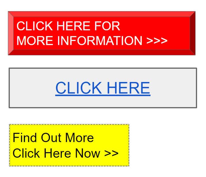
Buttons are interactive User Interface elements that play a key role in conversational flow. You really want people to click these buttons to progress their website journey so it’s worth paying attention to these basic best practices for buttons:
- Ensure that clickable elements actually look clickable. The way an object looks tells users how to use it. Visual elements that look like links or buttons but aren’t clickable, such as underlined words that aren’t links or elements that have a rectangular background but aren’t buttons, can easily confuse users.
- Label buttons according to what they do. The label on any actionable interface element should always tie back to what it will do for the user. Descriptive labels can help with this—users will feel more comfortable if they understand what action a button does. Vague labels such as “Submit” or abstract labels don’t provide enough information about the action.
- Design buttons consistently. Users remember details, whether consciously or not. When browsing a website, they’ll associate a particular element’s shape with button functionality. Therefore, visual consistency will not only contribute to a great-looking design but will also make the element’s behaviour more predictable to visitors. Using multiple button shapes will leave your user confused.
Imagery
It’s often said that a picture paints a thousand words. Humans are highly visual creatures and images are a powerful way to capture the user’s attention. When correctly selected a single image can convey more to the viewer than an elaborately crafted block of text. This is especially true where the visitors are simply scanning a page and looking at images and headlines. Additionally, images overcome language barriers in a way that text simply can’t.
The following approaches will help you integrate imagery into your web page design:
- Make sure images are relevant. Select images that are clear and support your product goals. One of the biggest dangers in design is imagery that conveys the wrong message.
- Avoid generic photos of people. When web visitors see faces of other humans on a website it makes them think that there are real humans behind the product or organisation. An effective way to engage users is to use human images in design. Be aware that in an attempt to build trust, some companies use generic stock images from image libraries such as istock, shutterstock, dreamstime etc. If visitors to your website see inauthentic photos, they may start to doubt the organisation.
- Use high-quality assets with no distortion. The quality of the photographs and images on your website can have a significant impact on the user’s impression. Pixelated images make visitors doubt the quality of your product, so make sure to test resolution sizes for various ratios and devices.

Want to pick up the phone and speak to us about your Website project?
Call us on: 01733 361729 mail: solutions@bdolphin.co.uk

Videos
With increasing Internet speeds, videos are more popular than ever, especially considering that they extend the time spent on site. Video is everywhere today. We’re watching it on our mobile phones, desktops and tablets.
When used effectively ( and the important word is “effectively”, video is one of the most powerful tools available for engaging an audience. Video allows us to convey more emotion, directly provide some authenticity and really gives people a feel for a product or service.
If you are looking to use video on your website, consider the following approaches:
- By default set audio to “off” , with the option to turn it on. When users arrive on a page, they don’t expect that it will play any sound. If they’re in a public place and not wearing headphones, they might not appreciate sudden and unexpected audio. In most cases, users will leave the website as soon as it plays.
- Keep promotional videos as short as possible. Business videos should be kept in the range of two to three minutes. There are no set rules, but according to the 2019 Video in Business Benchmark Report, 73% of business videos are two minutes or less, and only 2% are longer than 10 minutes. In our experience shorter promotional videos are more appealing to the majority of users.
- Make content accessible to all. Try to design your products for users with various abilities, including those who can’t hear or see. Approaches for accessibility, include adding captions to a video and providing a full transcript of the video.
Call-to-action buttons (CTAs)
Calls-to-action (CTAs) are buttons that guide users toward your conversion goal. The whole point of a CTA design is to direct visitors to a specific action. Some common examples of CTAs are:
- “Contact us Now“
- “Book a demonstration”
- “Arrange a factory visit”
- “Subscribe Now“
- “Want more information call 01733 361729″
- “Like what you see? Call into the office for a chat”
- “Get XXXXX Now”
- “Start a trial”
- “Download the book”
- “Start your journey towards improved an improved website”
- “Sign up for updates”
- “Make an appointment”
- “Get a consultation”
- “Do you want to XXXX? Yes or No”
- “Activate XXXX today!”
- “Your running out of time”
- “Act before its too late
- “Don’t miss out”
- “Limited availability”
When designing CTA buttons consider the following:
- Size – Not too Big, Not too Small. Your CTA should be large enough to attract attention. A way to establish if its noticeable is to view a web page for five seconds and then list the elements you remember. If the CTA is among the elements, then excellent, there’s a good chance it’s sized appropriately.
- Visual prominence. You can make certain buttons stand out by giving them more visual prominence. Contrasting colours work best for CTAs and make for striking buttons.
- Negative space. Along with size and colour, the amount of space around a CTA plays an important role in the visual hierarchy of elements. White (or negative) space creates essential breathing room and separates the button from other elements in the interface.
- Labels. Use action-oriented text for CTA labels, as this will compel visitors to take action. Use strong verbs like “Start,” “Get,” or “Join.”
Web forms
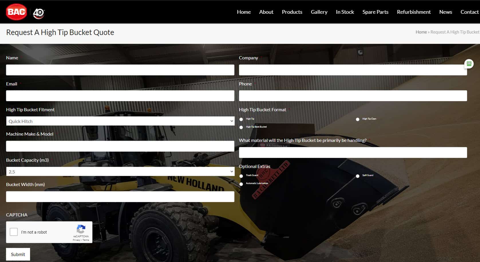
Filling out forms is one of the most important types of interaction for users on the web. Users should be able to complete forms quickly and without confusion.
We use Gravity Forms on all our sites – whilst its a costly plugin it provides great functionality and allows you to create a form that follows all the best practice below
Design recommendations that will help you improve your form design:
- Only ask for essential ( must have ) information. Every extra field you add to a form will affect its conversion rate. The more you ask, the less motivated users will be to provide the data. Always think about why you’re requesting certain information from users and how you will be using it.
- Order the form logically. For example, asking for someone’s telephone number before their name might seem strange.
- Group related fields together. Grouping creates a flow from one set of questions to the next. Grouping related fields together also helps the user make sense of the information.
Animation
Animation can be incorporated as a functional element to enhance the user experience. However, only if it’s incorporated at the right time and place will animation in the web design enhance the user experience . Good UI animation has a purpose; it is meaningful and functional.
Some example of animation enhancing the user experience:
- Visual feedback on user action. Good interaction design provides feedback. Visual feedback is helpful when you need to inform users about the result of an operation. If there’s a problem, functional animation can provide that information. For example, a shake animation can indicate that the user entered the wrong password.
- Visibility of system status. Visibility of system status remains one of the most important principles in user interface design. Users want to know their current context in a system at any given time, and a website should tell the user what’s happening via appropriate visual feedback. Data uploading and downloading are typical operations on the web and they are great candidates for functional animation. For example, an animated loading bar shows how fast a process is going and sets an expectation for how fast the action will happen.
- Parallax effects. Parallax is a popular technique in web design in which the background moves at a different speed than the foreground content while scrolling. This effect can introduce a sense of dynamics and movement into web layouts.
- Branding. Well-crafted animation establishes an emotional connection with visitors. It can highlight a product’s strengths and make the user experience truly delightful and memorable.

Web Design Fundamentals – Talk To A Human & Find Out More
Great web design is a crucial factor in attracting and retaining customers to a website. There are several fundamentals to great web design that need to be considered.
First and foremost, a great web design should be visually appealing and aesthetically pleasing. The design should be well-organised, visually balanced, and use an appropriate colour scheme that matches the brand identity. A good designer understands the importance of whitespace, typography, and layout in creating an appealing and engaging design.
Secondly, a great web design should be user-friendly and intuitive. The design should prioritise usability and user experience, making it easy for users to navigate and find what they’re looking for. The website should have a clear and concise navigation menu, with easily identifiable links and buttons. The website’s content should be well-structured, with appropriate headings, subheadings, and paragraphs to make it easy for users to read and understand.
Thirdly, a great web design should be optimised for search engines. This means using appropriate keywords and metadata, optimising images and videos, and ensuring that the website’s code is clean and streamlined. A good designer should understand the basics of search engine optimisation (SEO) and incorporate these practices into the design process.
Fourthly, a great web design should be responsive and accessible. With the increasing use of mobile devices to access the internet, it’s essential that websites are optimised for all devices. The website should be designed to adapt to different screen sizes and resolutions, ensuring that users have a seamless experience regardless of the device they’re using. Additionally, the website should be accessible to users with disabilities, following accessibility guidelines such as WCAG (Web Content Accessibility Guidelines).
Finally, a great web design should be aligned with the website’s goals and objectives. Whether the website’s goal is to generate leads, increase sales, or build brand awareness, the design should be optimised to achieve these objectives. A good designer understands the importance of designing with a purpose and creating a design that is tailored to meet the website’s specific goals.
Great web design should be visually appealing, user-friendly, optimized for search engines, responsive and accessible, and aligned with the website’s goals and objectives. These fundamentals are essential in creating a website that not only looks good but also functions well and achieves its intended purpose.
If you would like to know more about Web Design Fundamentals contact Andrew Goode MBA, MSc, FCIM Click here to arrange a call
Other articles linked with websites and marketing that may provide additional insight. Marketing metrics and analytics, marketing ROI Planning , marketing revenue analytics and Marketing Measurement Metrics and Website Design
If you are looking at generating online saes as part of an ecommerce strategy the following information may be of use. Combine with this boring but important information on what’s required to remain website compliant
Web Design Fundamentals FAQ’s
1. What constitutes the core architectural components of a modern website?
A modern website is fundamentally composed of structured markup (HTML), presentation layers (CSS), and client-side scripting (JavaScript), which collectively define content, styling, and interactivity. These front-end components are supported by back-end systems including server-side logic, databases, and network configurations that facilitate data exchange, scalability, and security.
2. How does user experience (UX) influence web design at a systems level?
User experience design governs the interaction model between users and the interface, prioritising intuitive navigation, task efficiency, and accessibility. It requires systematic planning of information architecture, user flows, and interface behaviour to ensure that the website aligns with user expectations and business objectives while minimising cognitive load.
3. Why is responsive design considered a non-negotiable requirement in contemporary web development?
Responsive design ensures that layouts, media, and interactive elements dynamically adapt to varying viewport sizes and device capabilities. This is critical due to the prevalence of multi-device usage, and it directly impacts usability, performance, and search engine visibility. Implementing responsive frameworks and fluid grid systems enables consistent cross-device experiences.
4. What role does information architecture (IA) play in web design fundamentals?
Information architecture defines the structural organisation and hierarchy of content within a website. It involves designing navigation systems, taxonomies, and content relationships to optimise discoverability and usability. Effective IA reduces friction in user journeys and supports both user experience optimisation and search engine indexing.
5. How do performance and optimisation considerations impact web design outcomes?
Performance optimisation, encompassing page load speed, efficient asset delivery, and minimised code bloat, is critical to both user retention and SEO performance. Techniques such as image compression, code minification, and server-side optimisation reduce latency and improve responsiveness, directly influencing engagement and conversion rates.


