
Rationale
The Overton product range covers street cleansing, beach cleaning and environmental markets ensuring there is a product to suit most needs. They manufacture vacuums and street barrows in their Lincoln factory and import specialist cleaning equipment from America and Europe to meet customers needs.
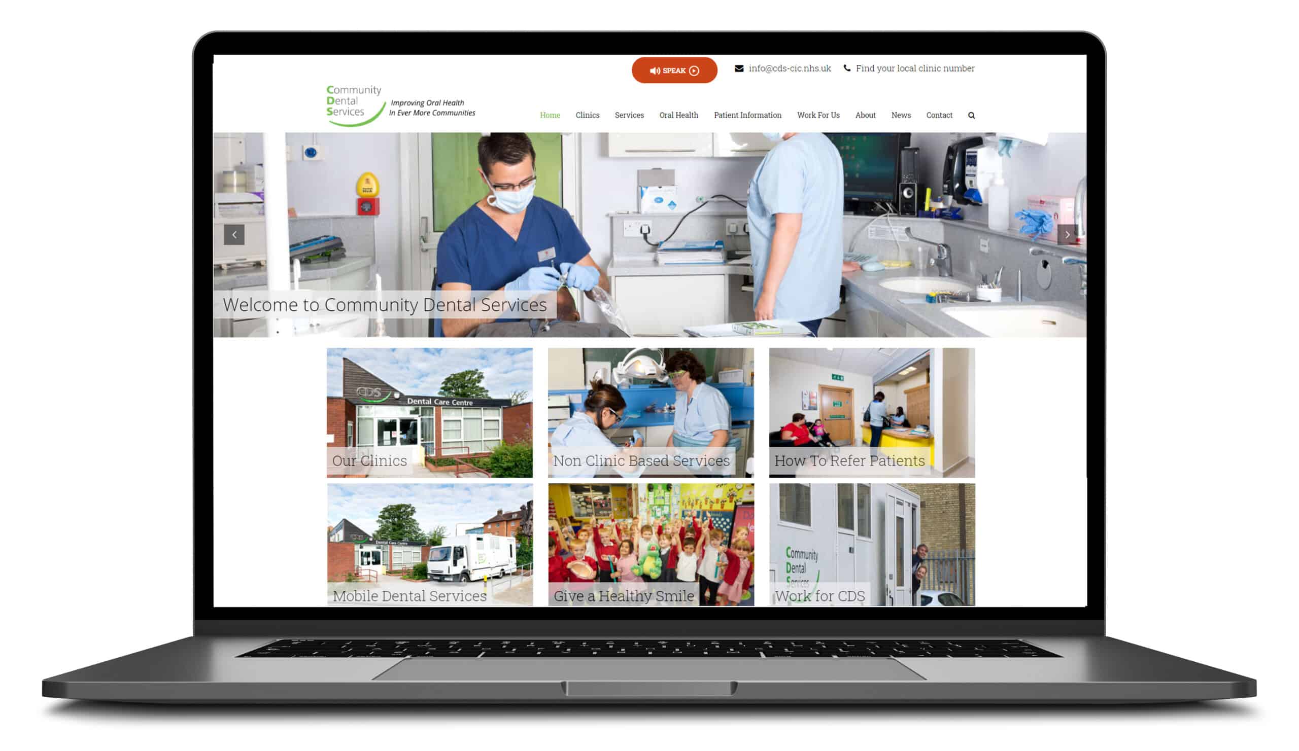
The old website was poorly designed and laid out which led to a very poor customer experience. Combined with a content management system that was very difficult to use it meant that changes to the website were either difficult or required the previous provider. As the company looked to increase export sales it became clear that the site needed changing.
Blue Dolphin are really easy to deal with, they talk in a jargon free way, communicate clearly and get stuff done. We are been really pleased with their proactive approach in helping us massively improve the way the site looks and performs.
Stuart Rose – Sales Director

Project Specification
- Scoping to evaluate and improve site navigation
- Design and build of responsive WordPress website that worked on mobile, tablets, laptops and wide screen monitors
- Create separate product pages to improve customer experience
- Make site HTTPS
- Improved and enhanced data capture
- Overton are constantly innovating and developing new products, it was critical that staff were able to easily and update content, images and pdf downloads to the site
- For more information on optimised and responsive website development click here
Key Benefits
- Site offered Spanish, French and German language options
- Site layout and design significantly improved
- Ability to capture visitor information ( and identify visitor requirement)
- Videos, Datasheets, Brochures added per product to provide improved UX
- Really simple content management system allows Overton UK staff to easily change and add new information
Scoping out a new website involves defining the project’s goals, identifying its requirements, and determining the resources required to build it. Here are some approaches that can be taken to scope out a new website:
- Define the Project Goals: Start by identifying the main objectives of the website, such as improving brand visibility, providing information to customers, generating leads or sales, or improving user experience. This will help you to determine the key features and functionality that the website should include.
- Conduct a Site Audit: Review your current website and its analytics data to identify any areas that need improvement and to gain a better understanding of user behavior and expectations.
- Conduct Stakeholder Interviews: Interview key stakeholders, including your target audience, internal teams, and stakeholders, to gather their opinions and requirements for the website. This will help you to identify their priorities and to ensure that the website meets their needs.
- Define the Site Structure: Determine the overall structure and hierarchy of the website, including the main pages and sections, and how they will be organized and navigated.
- Determine Required Features and Functionality: Identify the specific features and functionality that are required to support the website’s goals and to meet the needs of the stakeholders. This may include things such as forms, e-commerce capabilities, custom content types, and integrations with other systems.
- Establish a Budget: Determine the budget for the project, including the costs of design, development, hosting, and ongoing maintenance.
- Determine the Timeline: Establish a project timeline, including the key milestones and deadlines, to ensure that the website is delivered on time and within budget.
By following these approaches, you can create a comprehensive and detailed scope for your website project, which will help to ensure its success and to ensure that it meets the needs and expectations of your stakeholders.
Factors in designing a website for various screen sizes
- Responsive design: The website should be able to adjust its layout and content to fit the screen size of the device.
- Content hierarchy: The arrangement of the content on the page should prioritize what is most important, with the most important elements appearing first.
- Grid system: Using a grid system to structure the layout helps ensure that elements are properly aligned and spaced regardless of screen size.
- Font size: The font size should be legible on all devices, and the text should be easily readable without zooming.
- Image size: Images should be optimized for different screen sizes, with larger images for larger screens and smaller images for smaller screens.
- Navigation: The navigation menu should be easily accessible and usable on all devices, with drop-down menus or hamburger menus for mobile devices.
- Touch targets: Touch targets, such as buttons and links, should be large enough to be easily tapped on touch screens.
- Testing: The website should be tested on a variety of devices and screen sizes to ensure it looks and works as intended.