Web Design – The Bigger Picture
Web design is a ever changing and complex subject. Over 10 years ago when we were designing websites there was no need to even consider how a website would look on a mobile phone with a 50mm wide screen. Web Designers and developers have to consider both how the website looks (visual appearance) and how the website works (functional design). With multiple attributes to take into account, the process of web page design can be tricky. To help understand the issues we have prepared 3 articles for you.
In this article, we’ll focus on the main principles, simple efficient rules, and approaches that will help you create a great user experience for your website. We’ll start at big picture level with global things, like how to define the structure of the website (user flows). Looking at what to consider during individual web page design, also covering other essential aspects of design, such as mobile considerations and testing
Website Structure – Designing the user flows
The first thing to consider is the path by which the visitor will navigate through your website or your user flow. Putting it simply designing and building a website isn’t about creating a collection of individual / stand alone pages; it’s about creating user flows.
A series of steps
This path is a series of steps that the visitor takes from
- The first page where they land (entry point). Note only a small percentage of your website traffic will enter your website on the homepage many will arrive at other ranked landing pages
- Towards the specific action you want them to take (typically a conversion action, such as a download, survey, sign-up, purchase, etc.).
The following will help you determine your user flows as you design your website.
Information architecture (IA)
Information architecture is a discipline that allows you to organize information clearly and logically for your visitors. Information architects analyse how users structure information and create a hierarchy that aligns with the user’s expectations.
Good IA is a result of solid user research and usability testing.
Approaches to research user needs are varied and can include
- User interviews – one to one discussions with users in our opinion best done face to face but they can be done on the telephone or zoom
- Card sorting – participants organise topics into categories that make sense to them and they may also help you label these groups. To conduct a card sort, you can use actual cards, pieces of paper, or one of several online card-sorting software tools.
- Moderated usability testing – where observation on how people interact with the existing design and share their opinions on it.
IA is also used to define the site’s navigation and menus. When UX practitioners finish working on a menu, they use another technique called “tree testing”. Tree testing tells you how easily people can find information on your website, and exactly where people get lost to prove that it will work. Tree testing happens before designing the actual interface.
Global navigation
Navigation is a cornerstone of usability. When we analyse poor performing websites a common cause of visitors leaving the site is because they cant easily find where to go, they simply can’t navigate the website.
Navigation on your website should adhere to a few principles:
- Clarity. There shouldn’t be any guessing about what each navigation option means.
- Consistency. The navigation system should be the same for all pages on the website.
- Simplicity. Your navigation should help visitors understand how to get around on your site with the fewest clicks possible.
Consider the following when designing navigation:
- Select a navigation pattern based on the majority of user’s needs. Navigation should accommodate the needs of the majority of your website visitors. Don’t get distracted by one off user needs and always remember who the website is designed for and the websites purpose.
- Prioritise navigation options. Establish the common user tasks, considering both priority and frequency of tasks. Those that are common and frequent should get maximum focus
- Make it visible. Make important navigation options permanently visible. Equally minimise the number of options available ( so that a visitor isn’t bombarded by too many options) . Beware when we hide navigation options we risk that visitors won’t be able to find them.
- Make it easy for me to know where I am in the site. Failing to indicate the current visitor’s location is a common problem on many websites. If visitors have to ask, “Where am I?”, that’s a clear indication that your navigation needs some work. We would always suggest using breadcrumbs to help with this navigational issue
- Choose an appropriate menu structure. For example, it’s better to avoid hamburger-menu navigation if the majority of your users aren’t familiar with the meaning of the icon itself. Having an Uber menu may allow you to showcase multiple items but will a customer be able to understand it?
Want to pick up the phone and speak to us about your Website project?
Call us on: 01733 361729 mail: solutions@bdolphin.co.uk
Visual and functional design of web links
Links are a key element in web navigation. Their visual and functional design has a direct impact on usability.
Follow a few rules with these interactive elements:
- Recognise the difference between internal and external links. Users expect different behaviour for internal and external links. All internal links should open in the same tab so that visitors can use the “back” button.
- Change the colour of visited links. When visited links don’t change colour, users could unintentionally revisit the same pages multiple times.
- Double-check all links. It’s frustrating to arrive at a 404-error page. Use tools like Broken Link Checker to find any broken links on your WordPress website.
“Back” button in a browser
The “back” button is perhaps the most used button in the browser,
Therefore make sure the “back” button works according to user expectations. When a user follows a link on a page and then clicks the “back” button, they expect to return to the same spot on the original page.
Avoid situations in which clicking “back” brings the user to the top of the initial page, instead of where they left off, especially on long pages.
Breadcrumbs ( Great on Chicken, Superb for Navigation)
Breadcrumbs are a set of contextual links that function as a navigation aid on websites. It’s a secondary navigation scheme that usually shows the user’s location on a website.
Some important points for your websites breadcrumbs:
- Don’t use breadcrumbs as a replacement for primary navigation. Visitors should use the main menu to navigate; breadcrumbs should only support the visitors in that. When visitors rely on breadcrumbs as a primary method of navigation, rather than an extra feature, it is a clear indication of poor navigation design.
- Separate each level clearly. Use arrowheads as separators, not slashes e.g. Home>>Services>>Website Design>> WordPress Websites. A forward slash (/) can easily clash with product categories on e-commerce websites. If you’re going to use the forward slash, ensure that no product category will ever have a slash:
Onsite Search – making it super simple to get to specific site content
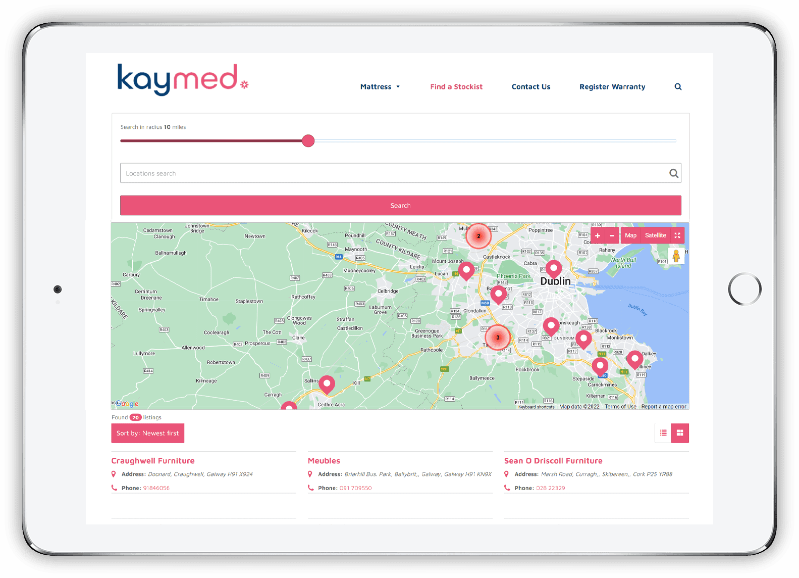
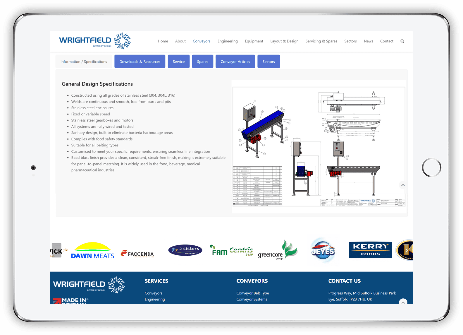
Some visitors come to a website looking for a specific item. Since they know what they want, they probably won’t use the navigation options to find it. The “Search” feature will act as a shortcut in this case. Visitors should be able to type text in a search box, submit their search query, and find the page they’re looking for. This is really important if you have a large website containing multiple pages of unique but similar content e.g. Wrightfield where they have numerous conveyor systems
Take these few basic rules into account when designing the search box:
Put the search box where users expect to find it research by A. Dawn Shaikh and Keisi Lenz, shows the expected location is the top left or top right of every page on a website.
- Use a magnifying glass icon to draw attention to the area. The magnifying glass icon has a universal meaning—most users are familiar with it.
- Size the input box appropriately. Making the input field too short is a common mistake. Of course, users can type a long query into a short field, but only a portion of the text will be visible at a time, which isn’t great for usability. In fact, when a search box is too short, visitors tend to use short, imprecise queries, because longer queries can be hard and inconvenient to read. 90% of queries will be accommodated by a 27-character input field
- Put the search box on every page. Show the search box on every page so that users can access it regardless of where they are on the website.
Designing individual web pages
Once you have reviewed user flow, it’s time to design the individual web pages. Key web page design guidelines are summarised below
Content strategy
When it comes to web page design, the most important thing is to design around the page’s objectives. Content strategy which refers to planning, creating, and managing content on your website helps with the activity. Every web page should be designed with the objective of achieving its own goal / objective. For example this could be informing visitors about a product / service, feature or benefit or encouraging them to convert / take action. Once you understand the goal of the page, only then should you work on the design or write the content.
Some practical tips to consider with your web page content strategy:
- Avoid information overload. Too much information on a page can easily overwhelm visitors. A simple ways to minimise information overload include is Chunking. This involves breaking content into smaller chunks to help users understand and process it better. A checkout form is a perfect example of this. Display, at most, five to seven input fields at a time and break down the checkout process into easy steps.
- Avoid jargon and industry-specific terms. Each unknown term or phrase that appears on the page will make it that much harder for visitors to understand the information. A safe bet is to write for all reading levels and pick words that are clearly and easily understandable to everyone.
- Minimise long sentences. Write in small, scannable segments. If possible sentences should be 20 words or fewer. For WordPress sites a plug in called Yoast has some great functionality allowing you to analyse readability.
- AVOID CAPITALISING ALL LETTTERS. All-caps dramatically reduces the speed of reading, so its best to avoid all caps for paragraphs, form labels, errors, and notifications. All-caps text is fine for acronyms and logos.
Page structure
With page structure there are no one-size-fits-all rules. A properly structured page will help visitors find each user interface element.
Below are a few web page design guidelines that will help you create a solid structure:
- Make it predictable. Look at your competitors’ websites, identify common design patterns, and align with user expectations by using design patterns that are familiar to your target audience.
- Use a layout grid. A layout grid divides a page into major regions and defines the relationships between elements in terms of size and position. With the help of a grid, combining different parts of a page in a cohesive layout becomes much easier.
- Use a low-fidelity wireframe to analyse / structure essential elements. Wireframing is a process that can help as part of the design process. Before building the page with real elements, create a wireframe, analyse it, and remove anything that isn’t absolutely necessary.
Visual hierarchy – the importance of scanning
Good visual hierarchy can significantly improve page scan ability. People are more likely to quickly scan a web page than to read everything there. Therefore, it’s a good idea to optimise your web page design for fast scanning.
You can help visitors find what they need with a good visual hierarchy, which refers to the arrangement or presentation of elements on a web page in a way that indicates their importance (that is, where their eyes should focus first, second, etc.).
- Use natural scanning patterns to match where people look when they’re viewing a page.
- The F-shaped pattern and the Z-shaped pattern are two natural scanning patterns that can help you to set the right path for the visitor’s eyes.
- The F pattern is better for text-heavy pages, such as articles and search results
- The Z pattern is good for pages that aren’t text-oriented.
- Visually prioritize important elements. Make important elements, such as key content or your primary call-to-action buttons, the focal points so that visitors see them right away.
Scrolling behaviour
A persistent myth among web designers is that people don’t scroll. To be clear: everybody scrolls, and people start to scroll almost instantly as they land on a new page. Put your most important information at the top of the page
Knowing about scrolling means you can improve the user’s experience with these tips:
- Encourage users to scroll. Despite the fact that people usually start scrolling as soon as the page loads, content at the top of the page is still very important. Put your most compelling content at the top:
- Answer the visitor’s question, “What’s this page all about?” An excellent introduction sets the context for the content
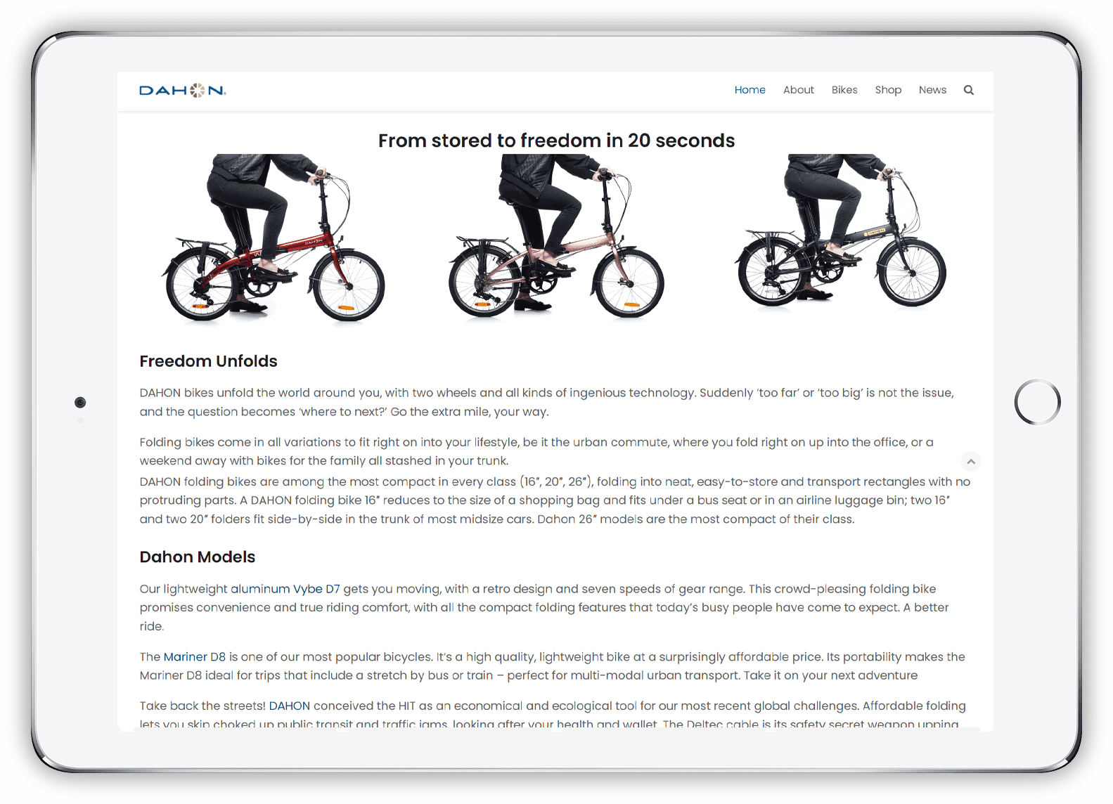
- Good imagery can accompany text and help visitors better understand the idea or topic, so use engaging relevant imagery.
- Orient your users. When you create lengthy pages, keep in mind that visitors still require a sense of orientation (of their current location) and a sense of navigation (other possible paths).
- Long pages can make navigation problematic for users; if the top navigation bar loses visibility when the user scrolls down, they will have to scroll all the way back up when they’re deep within the page. The obvious solution to this is a sticky menu that shows the current location and that remains on screen in a consistent area at all times.
Web Page Design – Talk To A Human
We have seen there are several key considerations to keep in mind regarding web page design. These considerations are crucial for creating a website that effectively represents the manufacturer’s brand, engages visitors, and achieves its intended goals.
One of the primary focuses should be on creating a positive user experience (UX). A user-friendly and intuitive website will enable visitors to easily navigate and find the information they need. It is essential to consider the target audience and their goals when designing the website’s layout, menus, and content structure. By understanding the user’s perspective, you can ensure that the website meets their expectations, making it more likely that they will stay engaged and explore further.
Branding and visual identity play a vital role in web page design. The website should reflect the SME manufacturer’s brand through its design elements, such as colours, fonts, and imagery. Consistency with the brand’s visual identity establishes trust and recognition among visitors. By incorporating the manufacturer’s logo, brand colours, and other brand-specific elements, you can create a cohesive and memorable user experience that aligns with the manufacturer’s overall brand strategy.
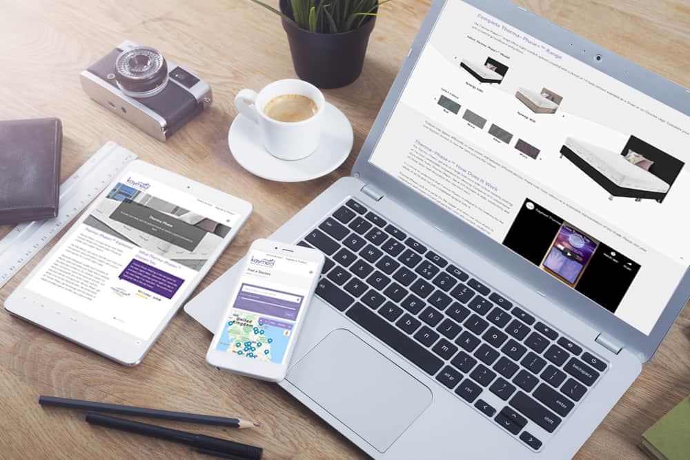
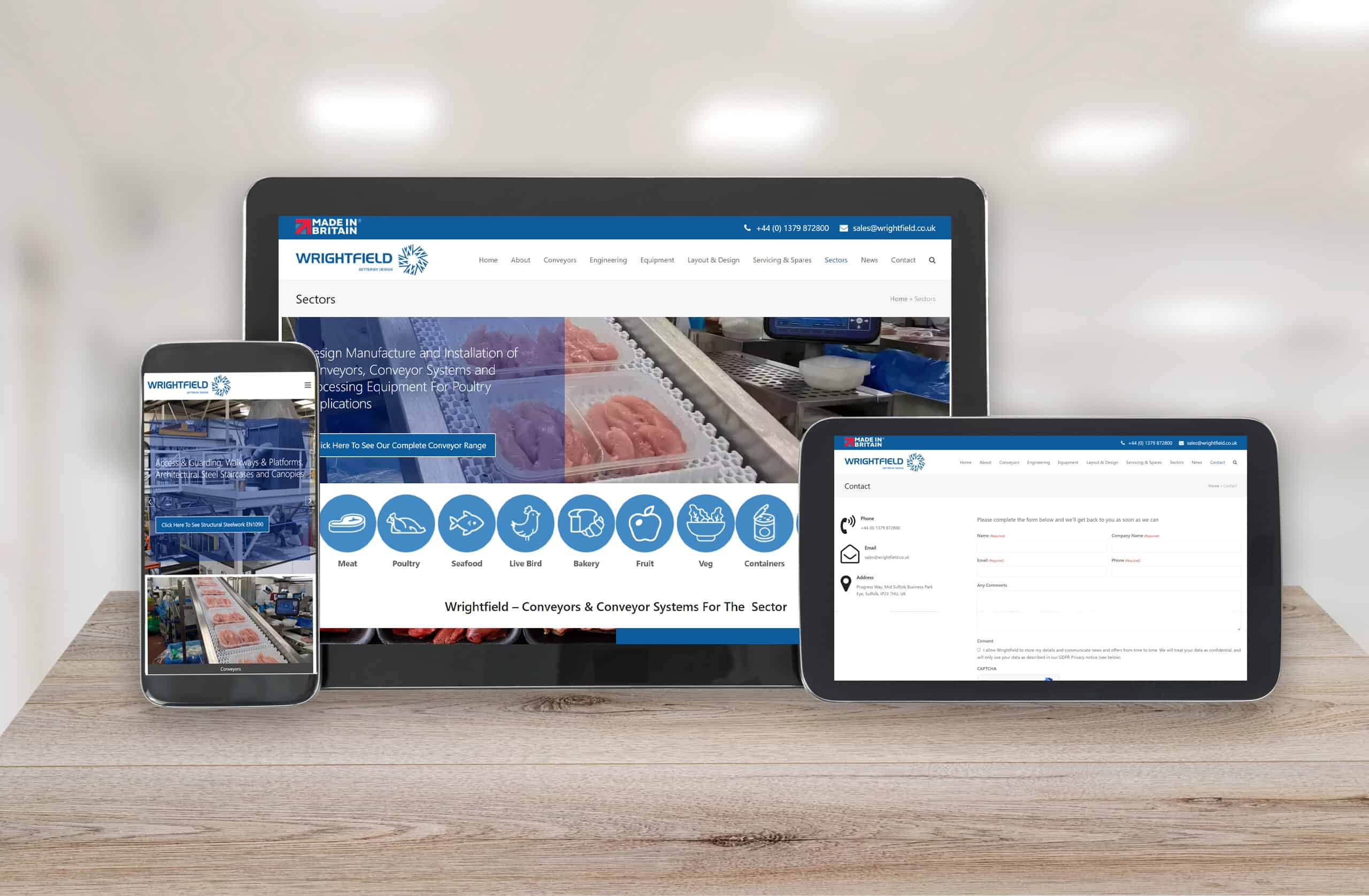
In today’s mobile-centric world, mobile responsiveness is essential. The website should be fully responsive and optimised for different devices and screen sizes. With the increasing use of smartphones and tablets, it is crucial to provide a seamless browsing experience across various platforms. Responsive design ensures that the website adapts and displays correctly on any device, enhancing usability and accessibility.
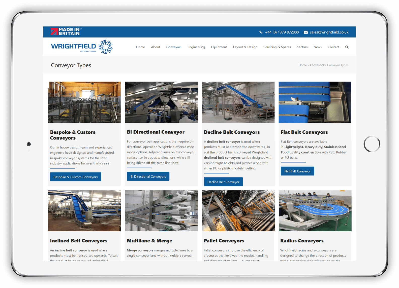
For an SME manufacturer, showcasing products or services effectively is paramount. Designing an appealing product showcase that includes clear visuals, detailed descriptions, and relevant specifications can greatly enhance the website’s effectiveness. Presenting products in an engaging and informative manner can help generate interest and lead to conversions. High-quality images, videos, and interactive features can be leveraged to provide visitors with a comprehensive understanding of the manufacturer’s offerings.
Calls-to-Action (CTAs) are critical elements in web page design. Incorporating prominent and persuasive CTAs throughout the website can encourage visitors to take desired actions, such as contacting the company, requesting a quote, or making a purchase. It is important to make the CTAs easily visible and compelling, using persuasive language and design elements that attract attention and prompt action. Effective CTAs can significantly improve conversion rates and drive desired user engagement.
A well-planned content strategy is crucial for providing relevant information about the SME manufacturer. Consider organising and presenting content in a logical and user-friendly manner. This includes including detailed information about the company, its products, capabilities, certifications, and any other important details. A balanced mix of text, images, videos, and other multimedia elements can be employed to engage the audience and effectively communicate the manufacturer’s value proposition.
Contact information should be easily accessible on every page of the website. Make it straightforward for visitors to contact the SME manufacturer by prominently displaying contact information, such as phone numbers, email addresses, and links to social media profiles. Including a dedicated contact page that provides various methods of communication can further facilitate interaction between the manufacturer and potential customers.
To ensure optimal performance, it is important to optimise the website for fast loading speeds. Slow-loading pages can lead to higher bounce rates, negatively impacting user experience and search engine rankings. Techniques such as compressing images, minimizing code, and leveraging caching mechanisms can help improve the overall performance of the website, ensuring a smooth and responsive browsing experience for visitors.
Implementing SEO (Search Engine Optimisation) best practices throughout the website design process is crucial for enhancing visibility in search engine results. This includes using relevant keywords in headings, page titles, and meta descriptions, optimizing image alt tags, and creating SEO-friendly URLs. By optimizing the website’s structure and content for search engines, it becomes more discoverable, increasing the likelihood of attracting organic traffic.
If you would like to know more about Web page design contact Andrew Goode MBA, MSc, FCIM Click here to arrange a call
Other articles linked with websites and marketing that may provide additional insight. Marketing metrics and analytics, marketing ROI Planning , marketing revenue analytics and Marketing Measurement Metrics and Website Design
If you are looking at generating online saes as part of an ecommerce strategy the following information may be of use. Combine with this boring but important information on what’s required to remain website compliant


