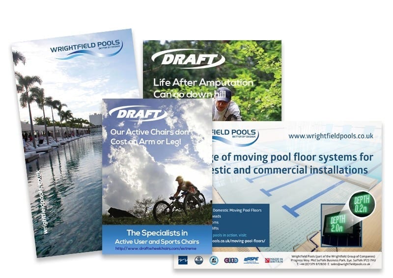


Wrightfield Pools – brand developed when a manufacturing company needed to market directly to architects, builders and residential purchasers
4 Bike – brand developed for a specialist range of bike accessories
Parlour Safe – brand developed for a milk production training accreditation system
1080 – brand developed to appeal to a younger more active customer used on product and packaging
Interested in having brand, logos or Icons developed contact Andrew Goode an experienced Marketing professional or click here for more examples
The stages in creating a business logo
- Research and planning: This includes identifying the target audience, researching competitors and their branding, and defining the company’s values and goals.
- Sketching and concept development: This stage involves creating rough sketches and concepts for the logo.
- Refining and digitising: The chosen sketch or concept is refined and digitised, usually in a vector format such as Adobe Illustrator.
- Presentation and feedback: The logo is presented to the client or internal stakeholders for feedback and revisions.
- Finalisation and delivery: The logo is finalised and delivered in various file formats for use in various mediums such as print, digital, and merchandise.
- Brand guideline : The logo design process is not over yet, it’s important to develop a brand guideline document which will specify the use of colours, typography, imagery, and other elements that are part of the visual identity of the brand.
How to evaluate logo designs
When evaluating new logo designs, it’s important to consider the following factors:
- Relevance: Does the design accurately represent the company and its values? Is it appropriate for the target audience?
- Simplicity: A good logo should be simple and easy to recognize, as it will be used in various contexts and sizes.
- Versatility: The logo should be flexible and able to be used across different mediums, such as print, digital, and merchandise.
- Originality: The logo should be unique and distinguishable from competitors.
- Memorable: A logo should be memorable, easy to remember and it should be easy to distinguish it from other logos.
- Timelessness: A good logo should be able to stand the test of time, rather than feeling dated quickly.
It’s also helpful to gather feedback from a diverse group of people, including employees, customers, and industry experts. This will give you a well-rounded understanding of how the logo is perceived by different audiences.
Ideas for coming up with new company names
- Descriptive: Use words that describe the company’s products or services, such as “Food Conveyors” or “Loading Shovel Attachments.“
- Location-based: Incorporate the location of the company, such as “Web Design Peterborough” or “Peterborough Engineering.”
- Made-up words: Create a completely new and unique word that doesn’t have any existing meaning, such as “Addidas” or “Google.”
- Acronyms: Use the first letters of a phrase or a series of words to create an acronym, such as “NASA” or “IBM.”
- Misspellings: Use a play on words or a misspelling of a common word to create a unique name, such as “Flickr” or “Yelp.”
- Combination: Combine two or more words to create a new name, such as “Facebook” or “Microsoft”
- Foreign words: Use a word from a different language, such as “Nike” which is the Greek goddess of victory.
- Personal name: Use the founder’s name or a family name, such as “Ford” or “Johnson & Johnson.”
- Abbreviations: Use an abbreviation of a phrase or a longer word to create a shorter, more memorable name.
- Rhyming: Use words that rhyme to create a catchy name, such as “Purple People Eater”
Note: Always make sure to check the availability and trademarks of the name before finalising it.
The importance of Font in a logo design
The font used in a logo is an important factor in creating a strong and memorable visual identity for a brand. A font can convey a brand’s personality, tone, and message, and it helps to create a consistent visual style for all of a brand’s marketing materials.
Here are some of the reasons why font is important in logo design:
- Legibility: The font used in a logo should be legible and easily readable, especially at smaller sizes. If a font is too decorative or difficult to read, it can detract from the overall impact of the logo.
- Personality: The font used in a logo can help to communicate a brand’s personality, whether it’s playful, professional, modern, or classic.
- Brand consistency: A consistent font style helps to create a cohesive visual identity for a brand across all its marketing materials, from business cards to websites.
- Versatility: A good logo font should be versatile enough to work well in a variety of contexts and mediums, including digital and print materials.
Overall, choosing the right font is an important consideration in the logo design process, as it helps to create a strong, memorable, and effective visual identity for a brand.
Your logo can be the first marketing message that a prospective customer sees. What does your logo say about you?
To find out more about having an appropriate logo created call 01733 361729 or email solutions@bdolphin.co.uk


